Reports and analytics
The Reports module turns operational data (tasks, transcriptions, scoring) into actionable analytics. It includes time series, emotion radars, quality weighting, and operator/campaign rankings — all with native export.
Accessing reports
From the sidebar → Reports. Access requires one of these roles:
| Role | Scope |
|---|---|
| Operator | Sees their own metrics on the dashboard (no Reports access) |
| Quality | Full reports for their campaign |
| Supervisor | Reports for every campaign under their management |
| Admin | Global reports + metric configuration |
Permissions are validated on every backend request. If you can't see the option, ask your admin — Roles and Permissions.
Featured widgets
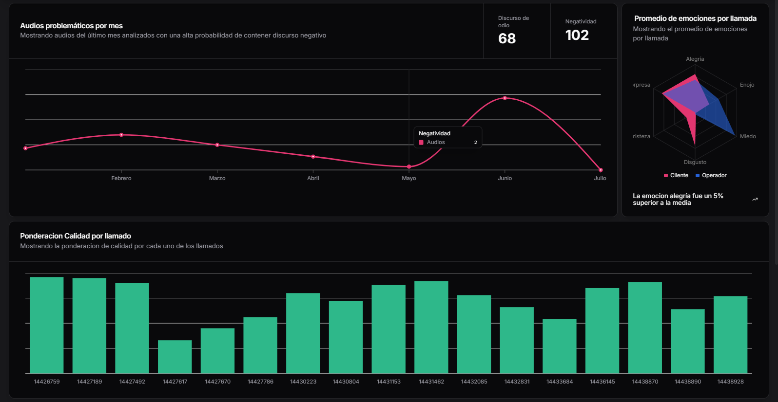
1 · Problematic audios per month
Line chart showing the number of audios flagged as problematic month over month. The system flags them automatically when detected negativity exceeds a configurable threshold (70% probability by default).
| Chart field | Description |
|---|---|
| X axis | Months in the selected range |
| Y axis | Number of detected audios |
| Hover tooltip | Per-month detail: Negativity · Audios · Ratio |
The top-right corner shows two aggregated KPIs:
- Hate speech — total audios with
hate_speech_score ≥ threshold. - Negativity — total audios with
negative_sentiment_score ≥ threshold.
2 · Emotion averages per call
Radar chart showing the emotional distribution between Customer (pink) and Operator (blue), projecting 6 dimensions: Happy, Angry, Fear, Disgust, Sad, Surprise.
Below the chart, an auto-generated insight highlights the most significant difference in the period — e.g., "The happy emotion was 5% above the average".
Interpretation
Compare the radar shape between customer and operator to detect:
- Friction — customer shows a lot of anger/fear that the operator's empathy doesn't match.
- Alignment — similar shapes indicate rapport.
- Overplay — operator shows excessive happiness versus the customer's real anger.
3 · Quality weighting per call
Bar chart showing the quality score of each individual audio. Each bar corresponds to a call_id (X axis). It allows:
- Hover to see the ticket ID and scoring detail.
- Click a bar to navigate to that audio's transcription viewer.
- Filtering by threshold to show only audios below the approval score.
Scale
The score is 0–100, where 100 is the campaign's ideal score. The approval threshold is configured per campaign (approval_score).
Period filters
All widgets respect a global time range selector at the top:
| Preset | Range |
|---|---|
| Today | 00:00 → now |
| Yesterday | Full previous day |
| Last 7 days | Rolling 7d |
| Last 30 days | Rolling 30d (default) |
| This month | From day 1 to today |
| Previous month | Full previous calendar month |
| Custom | Date picker with start/end |
Additional filters (campaign, operator, engine, direction) appear as chips below the selector and combine with AND.
Distribution and trends
Distribution by state
Pie/donut chart with the period's task breakdown:
| State | Suggested color |
|---|---|
| Completed | Green |
| In progress | Blue |
| Pending | Gray |
| Error | Red |
| Approved | Dark green |
| Rejected | Orange |
Time evolution
Line chart with drill-down (day/week/month). Useful for detecting:
- Volume peaks in seasonal campaigns.
- Anomalies — days with volume 3× the mean.
- Trends — improvement or deterioration.
Operator ranking
Table with operators sorted by a configurable KPI:
| Column | Example |
|---|---|
| Rank | #1, #2, ... |
| Operator | Juan Pérez (operator_id: 1897) |
| Audits | 145 |
| Average score | 87.4 |
| Approval rate | 91% |
| Trend | ▲ 4.2% vs previous period |
| Dominant emotions | Happy 45% / Neutral 40% / Angry 5% |
Individual profile
Clicking an operator opens the profile with:
- Score history (line)
- Breakdown by criterion (radar)
- Comparison vs campaign average (bars)
- Last 20 audits with link to the viewer
Coaching
Export the profile to PDF and attach it to the feedback session with the agent.
Campaign performance
Comparative view
| Campaign | Total | Avg. score | Approval | Avg. time | Trend |
|---|---|---|---|---|---|
| Sales Q1 | 450 | 78.5 | 82% | 4.2 min | ▲ |
| Technical Support | 320 | 85.2 | 91% | 3.8 min | = |
| Retention | 180 | 72.1 | 68% | 5.1 min | ▼ |
Sample data.
Per-campaign detail
- Historical score (line)
- Most failed criteria (horizontal bar)
- Top 10 problematic audios with direct link to the viewer
- Day-of-week × hour heatmap to detect critical time slots
Export
Each widget has a ⋮ menu with:
| Action | Format |
|---|---|
| Download data | CSV, XLSX, JSON |
| Download image | PNG, SVG |
| Copy as table | Clipboard (Markdown) |
For consolidated reports the Export report button at the top assembles a PDF with every widget on the dashboard plus a cover page with applied filters and metadata.
Scheduled reports
From Settings → Automated reports you can:
- Pick an existing dashboard.
- Configure cadence (daily, weekly, monthly).
- Choose recipients (email list).
- Choose format (PDF attachment, link to the dashboard, or in-body summary).
Delivery
Scheduled reports are sent from no-reply@auditoria.app. Make sure to whitelist the domain on your mail server.
Troubleshooting
| Problem | Cause | Action |
|---|---|---|
| Widget "No data" | Empty period or no permissions on that campaign | Widen range / check permissions |
Scores with null | Tasks with no approval_score configured | Ask the admin to complete the campaign |
| PDF export takes a long time | Too broad a range (months × many widgets) | Shrink range or use scheduled reports |
| Numbers differ from the list view | The list may have different implicit filters | Compare active filters on both views |